Some call it a sponsorship sheet or packet. Some refer to it as donor benefit levels. Whatever you call it, the menu, or tiered giving model, is a demonstratable, effective tool for communicating with major donors or sponsors.
What’s a menu?
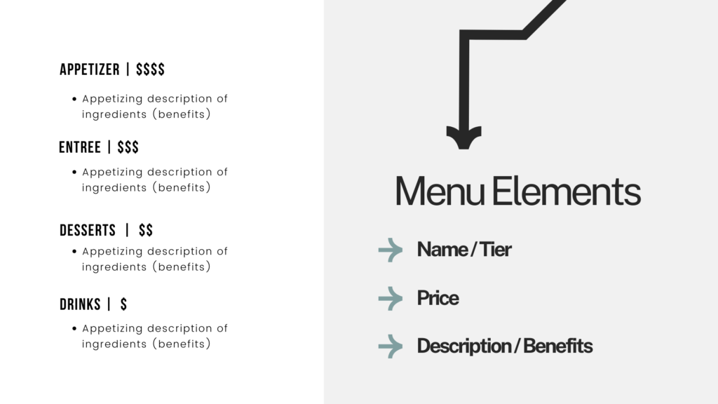
A menu is typically a one-page document that outlines 4-5 giving options. Each level includes the name of the TIER, PRICE, and BENEFITS. Strong menus include a THEME and impactful VISUALS.
A menu offers special benefits to your higher-than-average donors or corporate sponsors in exchange for a donation.
A menu can be catered to fund your programs, mission, events, or even spaces.
An example menu for an upcoming fundraiser might be:
| Gold Sponsorship | Silver Sponsorship | Bronze Sponsorship | Copper Sponsorship |
|---|---|---|---|
| $10,000 | $7,500 | $5,000 | $2,500 |
| Gala Naming Rights, 2 Tables at Gala (16 tickets), 3 Minutes of Speaking Time, Logo on all Promotional Materials, Thank You Slide Mention | Logo on all printed promotional materials, 1 table at Gala (8 Tickets), Thank You Slide Mention | Logo on website, 4 tickets to Gala, Thank You Slide Mention | 2 tickets to Gala, Thank You Slide Mention |
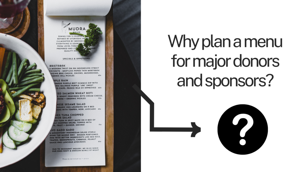
Why plan a menu for major donors and sponsors?
The menu is a common tool to help communicate opportunities for funders to engage with your organization. This tool can help you:
- Deepen Relationships through an Exchange of Benefits
- Honor & Celebrate Giving History and Participation
- Establish a Giving Frequency (Leading to Less Irregular/Infrequent Gifts)
- Provide a Tangible Community Impact of Donation (Leading to Increased Donation Size)
- Communicate Availability or Unique Accommodations
How do I make a menu?
First, be sure to do some digging around. Has your organization used a similar model in the past? Utilize what your organization has already developed. From there, you can spice it up! But don’t worry, even if this is your organization’s first menu, we have all the tips and tactics you need to get going.
When creating or refining your menu, think of your community and mission.
Why are you creating a menu? Who is it for – corporate sponsors or major donors? Will it be connected to a fundraiser, or are you looking to build more predictable giving patterns with irregular donors? Perhaps you’re looking for someone to sponsor a sculpture or a bench on your campus. Think about your goals and chat with a colleague or board member to refine the goal further.
What is your target community (those who will see the menu) passionate about? What is at the heart of your shared values? Based on historical data, when and how does your community like to give? How can you connect more deeply, human-to-human, with this target audience through a unique THEME and the names of each TIER?
Once you’ve given it some thought, read more below!
Elements of A Menu

THEME & TIERS
Your menu’s theme can be quite creative and engaging. Think about your mission and what could tie in nicely: perhaps you go with Famous Painters, Historical Figures, Wonders of the World, Careers… Trees? Be creative, connect emotions, and share your organization’s story and personality when creating TIERS!
Instead of Gold, Silver, Bronze, Copper, what if you went with…
- World Traveler, Achiever, Explorer, Path-Finder
- Nourisher, Farmer, Gardener, Planter
- Martin Luther King Jr., Ella Baker, Rosa Parks, Malcolm X
- Water, Earth, Air, Fire
- Pyramid, Column, Statue, Plaque
- Community Leader, Organizer, Advocate, Voter
What ideas do you have for your organization? Jot them down!
A strong THEME communicates core values, rooted in your mission and brand. Baking these concepts into each giving level can help corporate decision-makers and donors choose you over another cause.
THE PRICE
Most donors give at the second lowest TIER, so reach for the stars! The PRICE points should allow some room to grow. For example, let’s say you’re a small nonprofit. An average donor at your organization gives $50 a year. You might set an aspirational level of $100 as your lowest TIER, even if you don’t think prospects could contribute that amount right now. Don’t sell your organization short! From there, your second TIER might be $250 or $500. Scale upwards for mid-sized and larger nonprofits.
Note that not all items on your menu are for everyone, and that’s okay! If you’re a prospective donor (hungry person?) you might want oysters… or cheese curds. Like browsing a menu in a restaurant, donors and sponsors make their choice on a few factors: what they want right now, how much they have to spend, what benefits it will bring them, and who’s buying.
THE BENEFITS
Regarding the BENEFITS – consider developing unique offerings based on what your donors need or want; ideally, things that don’t cost you a lot of money or time. A private backstage tour at your theater, dinner with the founder, and recognition in your annual report – cost you little – aren’t too time-consuming – and ultimately help strengthen relationships. If there’s something extra special – a donor might be willing to splurge for that benefit. Encourage your prospects to choose a higher level by limiting benefits at the lower tiers, and adding your best BENEFITS at the top.
If you’re unsure of what or how your major donors or sponsors want to be recognized or engage with your organization, it’s always a great idea to get the inside scoop! Invite a long-time donor out to lunch and ask them what they want and how they want to be engaged and recognized.
THE VISUALS
The menu is all about outlining easy-to-digest choices, and the VISUALS should reflect this.
A busy menu can create decision fatigue, while a curated menu streamlines and makes it easy to choose. With a menu, strong VISUALS are very important in communicating shared values. Donors support causes because of their important correlation and alignment with your values. These shared values could be empathy, compassion, advocacy, access, community, justice, or many others. Developing imagery around these ideas can help evoke this connection and sense of commonality. Use your most impactful photography and develop a creative, digestible design that aligns with your brand identity and these key connectors.
Think about everything you’d like to include on your one-sheeter. Draw an outline on a piece of paper before you jump into digital design – this can save you a lot of time if you work out the general flow or content “zones” you want to feature. You can also browse these free Canva templates to get inspiration, or copy a template and customize from there!
Great design is made with a heavy consideration of the empty space between content. While your white space might not be the color white, it’s important to create plenty of room between your headers, text, images, and graphics to help grab attention.
EDITING YOUR MENU
Set yourself up for success with not too many out-of-reach BENEFITS and only 4-5 TIERS; this makes it easier for your donor community to choose what works for them.
When in doubt, simple is better- so grab an editing buddy!
In addition to the menu, include an organizational summary and a description of what this sponsorship is for. It’s helpful to include your mission, key community impact numbers, and a clear, concise description of the event or project attached to the sponsorship opportunity. Bonus if you can fit this comfortably on one page with your menu! A two-page sponsorship packet is still very strong if you have powerful impact pie charts or other eye-grabbing, content.
Final Thoughts
While there are many considerations when building a menu, ultimately, there are no rules!
Have fun and try something different with your THEME and TIERS.
It’s more important that you customize and create a unique menu for your donors or potential sponsors. What will get THEM excited to participate? That’s what it’s all about.
Have questions or want to chat about your sponsorship sheet? Email kd@nextinnonprofits.com.
Okay… I have my menu. Now what? How do I actually secure a sponsorship?
Check out: How To Get Corporate Sponsors For Your Nonprofit: Outreach Strategies, Tips, and Tactics


